Ford Drive

I lead a distributed design team successfully launching Ford’s first direct-to-customer EV subscription service.
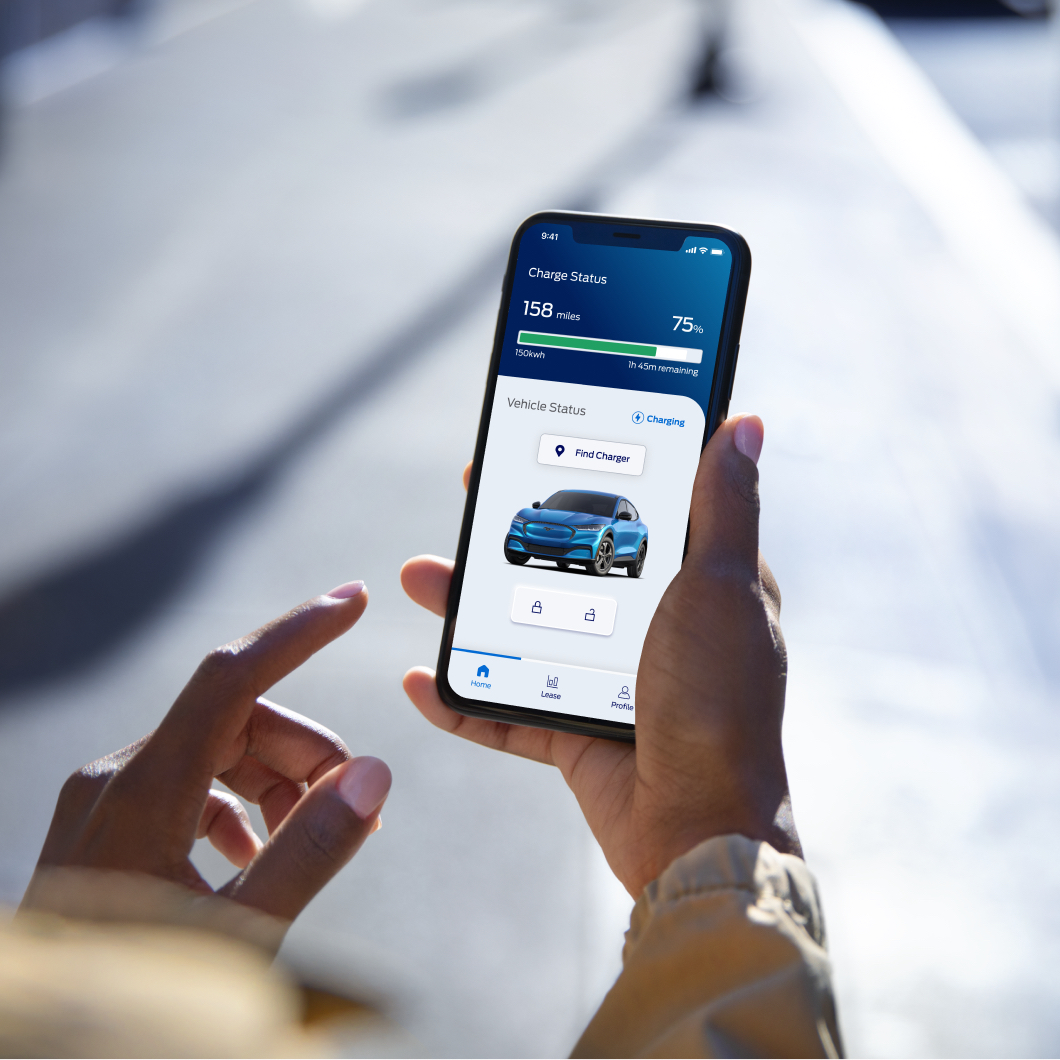
Currently available to rideshare drivers, the Ford Drive service helps to democratize electric vehicle (EV) access while reducing the carbon footprint in our urban areas. The Ford Drive service offers a flexible lease that allows rideshare drivers to select their Mustang Mach-E with zero money upfront and no long-term commitments. The vehicle is delivered to the driver within two weeks, and they use the Ford Drive app to manage payments and service. In each city, the Ford Drive team works with local dealers to purchase a fleet of Mustang Mach-Es. Service and maintenance of those vehicles is included in the subscription.
As the digital product design manager, my contributions include:
⁃ I lead the ideation, research, and design of our companion mobile app (iOS and Android) along with the redesign of our web portal app and marketing site (all coming soon).
⁃ Along the way, I worked with our product and software development teams to improve overall work flows, jira management, and Figma documentation to increase the speed of sprint deliverables and quality assurance.
⁃ Working with brand and my design team (3-6 people), we've created and managed a robust design system for native mobile and responsive web designs.
As seen on:
- Tech Crunch - The Verge - electrek
The "Ford Drive" mobile app is now available for active customers on iOS and Android

The Opportunity
User Need: Uber drivers wanted to focus on customer service but were constantly juggling other information and trying to optimize their routes.
Design Solution: A centralized tool to help organize information and offset the cognitive burden of optimizing data.

Mobile App Process

Discover
Cross-team product concepting
I organized a series of early discovery workshops with our product and engineering teams, developing a number of concepts based on our user insights research.
I then worked with design team to visualize those final concepts and pitched them our division VP. He presented them to the Ford CEO for final approval, before we moved forward with user feedback.

Define
Filtering with Surveys and refinement
To test our early concepts, I created visual stimuli and worked with our researcher to run a quantitative survey of 1,000 US rideshare drivers across the US to rank concepts.
After reviewing our survey feedback, I partnered with our Product Manager (PM) to run a workshop with our engineering and business teams to further define our product roadmap. I leveraged a 2x2 framework of Impact vs Effort to build final consensus amongst all stakeholders.

Develop
Evolution through research
While maintaining our sprint velocity, I led my team through multiple design iterations and quick research cycles to focus on core functionality while improving our aesthetics and testing usability.
Round 1: Ran remote Usability Testing to inform information architecture changes to increase ease of navigation.
Round 2: Conducted in-peron Desirability Interviews with our first cohort of drivers. Participants were provided with a clickable mobile app prototype and gave feedback on core and advanced features.

Delivery
Improving communication and handoff
Engineering/PM/Design refinements were crucial to defining roadmap and ensuring that my design team could stay 1-2 sprints ahead for discovery work/testing before pushing to development.
After receiving feedback from our development team from our other digital products (web portal app and marketing website), I worked with my senior designer to create more efficient and consistent naming conventions and folder structures.
Within each delivery file, I also worked to have more consistent prototyping of interaction patterns and detailed documentation. This process improvement greatly improved the efficiency of our QA process and speed up final delivery to customers.

Deliver & Listen
"Outcomes over Output" (Lean UX)
I worked with our PM and Dev team to monitor Amplitude and check usage data to find signals. Would then have follow up calls with customers to unpack signals. Important to ask questions: "Was a feature not being used because it wasn't effective or because it wasn't discoverable?" Through this feedback loop, we were able to constantly improve features and/or shift priorities when needed.

Outcomes
- A companion app for managing payments, mileage, packages, and vehicle controls.
- Currently live on iOS/Android with 335 users at 85% weekly usage (90% Return rate vs. 20% on existing Web portal).
- Greatly reduced customer care calls and increase payment rates.


